Friday, 27 May 2016
Monday, 11 April 2016
LO5 - Evaluation
Looking over what I have done on my website, I'm overall pleased with how it has turned out. Most of the results from the user test plans were positive. However, based on the feedback from the test plans, there are some improvements that I could have made.
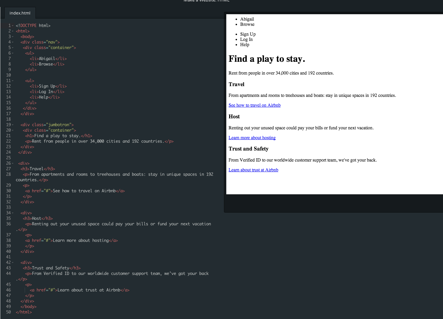
There was a missing link on an image on the Products page. The image above the word "Machines" does not contain a hyperlink to the page titled Machines. However, there are other ways of reaching the page, such as the link in the main navigation bar, the text "Machines" itself, and the "online store" link on the home page.
Some feedback from the test plan suggests that the house style of the website isn't fully consistent. I agree with some of this feedback, as the block of text on the home page is blue, whereas none of the other text on the website is blue. However, I disagree with the feedback that stated there was too much black text on some pages, as too much text of any other colour would be too overwhelming, or not stand out enough on the page.
I also disagree with the feedback that states that the yellow in the cart side-bar is not consistent. The "add to cart" button on each product page is also yellow, following the theme of a yellow cart icon, and a yellow "view cart" button in the pop-up side-bar.
There were no other apparent issues or improvements to be made.
Sunday, 3 April 2016


Saturday, 2 April 2016


Friday, 1 April 2016


Friday, 18 March 2016
LO4 - Website Assessment
Navigation
The website is easy to navigate, with clear links that are easy to identify. Links are sorted logically in the menu at the top of the website. There is more than one link to access some pages, for example there is a link to the shop page from the home page as well as the products page.
Internal and External Hyperlinks
Based on user feedback, there is a small error in an internal hyperlink which will be fixed. All of the other internal and external hyperlinks are functional and go to the link they should go to.
Page Load Times and Performance
Loading times on all browsers is relatively quick, however Safari takes slightly longer than the other browsers. There doesn't seem to be too much delay in the loading time of the website on any browser. The website runs easily on all these browsers.
Consistency of House Style
The house style is generally consistent throughout the website, particularly in the font. The colours of parts of the text could be changed to more suit a house style.
Thursday, 18 February 2016


Wednesday, 17 February 2016
LO2 - Potential Revenue
The Small Machines website is a site that sells products, so the most obvious revenue that will be made from the website is the money earned from the sale of the products.
Another way to earn money from the website is sponsors.
Small Machines works with the Royal Armouries and sells some of their products on the Royal Armouries website, which might lead to the Royal Armouries wishing to advertise on the Small Machines website.
Small Machines is a small, independent business that is looking for lots of customers. If other small businesses sponsored the website and used it for advertisement, both businesses could benefit from the results.
Monday, 15 February 2016
LO2 - Budget
It would be preferable to have a premium account, which
allows features such as a good shopping interface and a custom domain (being
able to change the format of the URL from
http://09harrisa.wix.com/smallmachines into something more suitable). This
costs £10.42 per month for one year, which comes to a total of £125.04 for one
year.
I used Adobe Photoshop to edit the images I took of the products. The cost to own Photoshop is £17.15 per month.
If I wanted to hire a professional freelance photographer to take commercial photographs for the website, the price for one day of shooting starts at around £400.
Friday, 12 February 2016
LO2 - Projected Launch Date
I hope to launch the website on Friday 26th February. All parts of production will be complete by that date.
Wednesday, 10 February 2016
LO2 - Legal and Ethical
Intellectual property
Copyright/Data protection
Because the website will be created using Wix, all
I need to make sure that my website doesn't contain copyrighted materials that aren't affiliated with the Small Machines company.
SSL would help to protect the data on the website if I needed a shopping feature in which customers would use their bank card details to purchase products.
The content of the website needs to be suitable for all audiences including children, and not contain anything unsuitable. The ASA covers all media and my website should comply within its rules.
WaSP is a web organisation that keeps websites' data organised, accessible and easy to display on all browsers. My website will be accessible on all browsers and any issues in the code/display of the website will be fixed.
Monday, 8 February 2016
LO2 - Information Flow
The main way of navigating the website that the audience will use is the navigation bar at the top of every page in the header. There will be other ways such as titles and images on every seperate page, linking to different parts of the website in many different ways.
Another way that allows users to navigate a website is a site map. A site map contains all of the pages on the website on another page. The Apple website's site map is a good example:

Another way that allows users to navigate a website is a site map. A site map contains all of the pages on the website on another page. The Apple website's site map is a good example:

Friday, 5 February 2016
LO2 - Technical Learning: Code Academy (2)

I started looking at how CSS affects a web page.

It goes into detail with different features that you can alter.
Wednesday, 3 February 2016
LO2 - Code Academy recap
Last lesson I used codecademy.com to learn the basics of coding HTML.
Most of the terms covered were new to me, such as "ul" and li", which creates a set of bullet points with ul showing the start and end and li starting each new point.
I will need to use nearly all of the HTML features that have been and will be covered on Code Academy.
Most of the terms covered were new to me, such as "ul" and li", which creates a set of bullet points with ul showing the start and end and li starting each new point.
I will need to use nearly all of the HTML features that have been and will be covered on Code Academy.
Monday, 1 February 2016
LO2 - Annotated Wireframes
Home Page

1 - Small Machines logo
The logo will be in the very centre of the header and will be able to be seen on every page for emphasis.
2 - Navigation bar and cart
The navigation bar will also be in the header on every page. The pages documented in the navigation bar go as follows:
• Home
• About Small Machines
• Products
(- Machines
- Royal Armouries Range)
• Contact Us
• Blog
And the cart on the right.
They will be in the font Museo to match the house style of the rest of the site, most of which will be in the same font. It will be white to stand out from the background it will be over, which will be brown.
3 - Page and main site title
This will also be in the Museo font. It will be brown to match the house style, and to stand out from the pale background. I will try to add some sort of effect like a drop shadow to give it emphasis and draw the user's eye.
4 - Slideshow
This will be a slideshow full of bright and eye-catching pictures of the products. It should catch any audience's eye, from children looking for exciting toys, parents looking for authentic presents or experienced and serious collectors.
5 - Brief introductory text
This small paragraph will welcome the user to the website. It will be aimed towards an audience of adults, since these are the people who are most likely to scrool further down the page and pay attention to the text as well as the eye-catching pictures.
About Page

1 - Page Title
This will be in the site's primary font, Museo. It will be red/brown to match the house style.
2 - Images
There will be some pictures to break up the page. These pictures will need to reflect the lifestyle and ideals of the company.
3 - Main text
This will describe where Small Machines began, what it is today, and how it got there, in a few paragraphs. It will also include information about the Royal Armouries range.
Products Page

1 - Page title
Again, the title will be in the Museo font and will be red or brown to fit the house style.
2 - Product images
Each image of the products will be vibrant and eye-catching. They need to attract the attention of any audience, children and adults alike.
3 - Product name and price
The product names and prices will again be in the site's main font, Museo. They will be a dark colour, like dark brown, or black
Friday, 29 January 2016
LO2 - Technical Learning: Code Academy
HTML - Hyper Text Markup Language
HTTP - Hyper Text Transfer Protocol


HTTP - Hyper Text Transfer Protocol

The link after "src=" is the URL of the image on the right. This is how images are inserted into web pages.

I started to practise using code after I learned some of the basic features. The UL tag begins bullet points, and each Li tag makes a new bullet point.
I started to use more and more features of a HTML such as Div and Containers.
Thursday, 28 January 2016
LO2 - Basic coding
Today I learned the basics of how a website is structured in terms of text and graphics, and had the chance to change aspects of it. I also learned some of the key aspects of how the coding affects the layout, such as <title> and </title>.
Wednesday, 27 January 2016

LO2 - Planning a multi-page website (content)
A multi-page website needs lots of relevant content to
make it substantial. I will design and produce a home page, a contact page, a
page describing the company and many more pages that will fill the website. The
content will be relevant, with lists of products and maybe the location of the
studio, and where you can buy products.
There will be a navigation bar at the side for the user to navigate through the website.
There will be a navigation bar at the side for the user to navigate through the website.
LO2 - Content: Mind Map and Mood Board
This mind map and mood board describe the sort of ideal content that would be on the website. The content would appeal to both adults and older children alike, with features that both will find interesting and useful.


Tuesday, 26 January 2016
LO2 - Planning a multi-page website (audience)
The audience for the website will be parents in the ABC1
socioeconomic demographic who are searching for toys to give to their children,
or maybe collectors who are looking for professionally-made wooden toys.
Another type of audience are children who are looking for toys to potentially
buy, or anyone who is interested in the making of wooden toys. Other people who
might be interested in the site might be people who are fans of the products
already, or people who personally know someone who works for Small Machines. The
website needs to have features that cater for the needs of these different types
of audience.
Monday, 25 January 2016
LO2 - Planning a multi-page website (purpose)
The purpose of the Small Machines website will be to
advertise the product to the audience. It will give the audience information
about what they do, their products and other information about the company.
There will be details on how the toys are manufactured, and instructions on how
to put the toys together. There will also be videos describing how the toys
operate, and navigational features at the top of the page under the logo in
order for the customer to find out more depending on which sort of audience
they are. There should be access to anything a customer might want to know
about the products, for example the price of a product.
Starter/brief content
I am doing the Small Machines brief for Unit 34.
Small Machines – promotional website for ‘Small
Machines’ range of wooden toy kits.
Content that might be on my website might include:
- Photographs of products
- A basket for the option to buy toys
- An option to log in so the basket will be saved
- Information on the toys
- Descriptions of specific products
- Prices
- A logo
- Search bar
Pass
Purpose, audience, content, production plan
Merit
Information flow, justification of choices in relation to audience requirements, legal and ethical
Distinction
Navigation, launch date and timescales, budget, revenue potential
Subscribe to:
Comments (Atom)